FNB asked us to have a look at their emails and come up with a proposal to make them better. The issue they were facing was twofold; FNB Cardholders were either not using their credit cards or only using them for big ticket purchases
FNB's assumption was that if they created better, more engaging emails, FNB customers would use their credit cards more often.
FNB's assumption was that if they created better, more engaging emails, FNB customers would use their credit cards more often.
Our research showed us that most consumers fear credit because they do not understand how it works and feel they can get themselves into debt too easily by using credit cards. We realised that email communications would not solve this problem, so we looked at FNB's online banking platform to see if we could make the way credit card balances were shown more easy to understand.
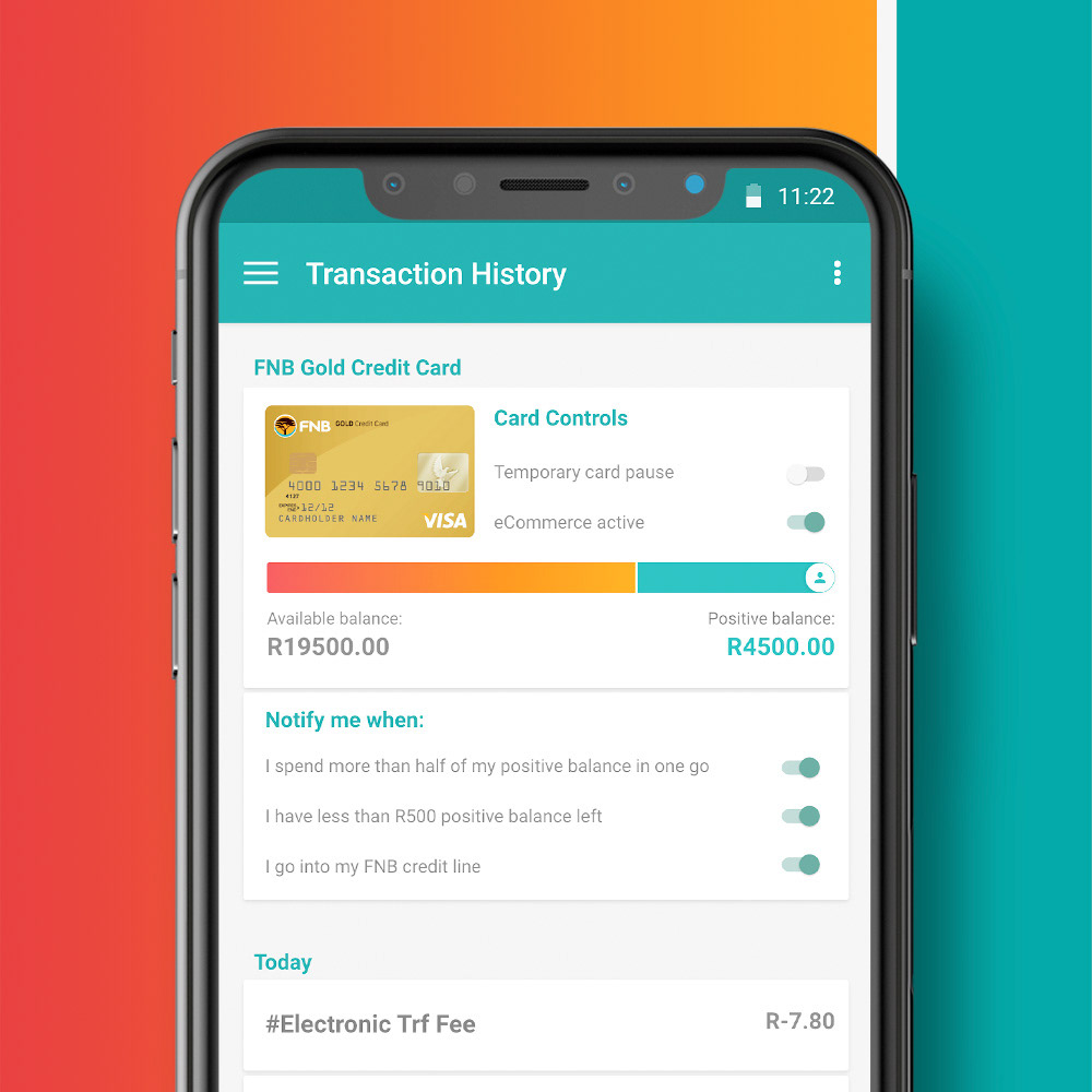
Our solution involved visually representing all aspect of the cardholder's credit balances including showing how many days they had interest free, or how much they owed in interest and when they would be billed.
We even showed when cardholders had a positive balance in their credit cards and how they could use that to their advantage
Our proposed UX for FNB credit cards
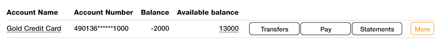
This is the web view of all your accounts in the FNB website. There's no visual hierarchy and it's hard to see at a glance how your accounts are looking. It's clear that the sales team got their way and made the promotions the most important things visually.

The below is what your credit card looks like in isolation. The way monetary values are handled is completely different to a normal chequing or savings account and people get very confused by what's going on. Our research showed this confusion leads to people being too afraid to use their credit cards.
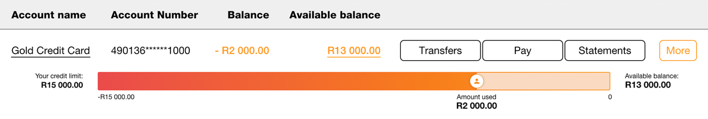
The first thing we wanted to do, is show you visually what your credit card's balance looks like. We used an orange bar to show your credit line. The line gets progressively more red as you use more of your credit line. We also showed your credit limit as a figure, along with the available balance, making it more like a normal account.
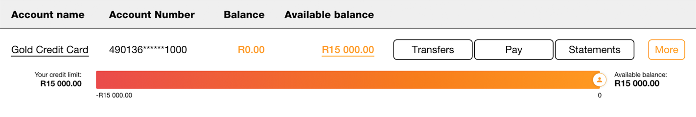
As you used your credit funds, we would visually indicate how much had been used as well as provide the exact value as a figure.
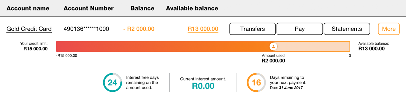
Then we showed people how many days they had until they would begin to pay interest on the amount of credit they had used. Showing them this along with the next payment date could help take the guesswork out of using a credit card.
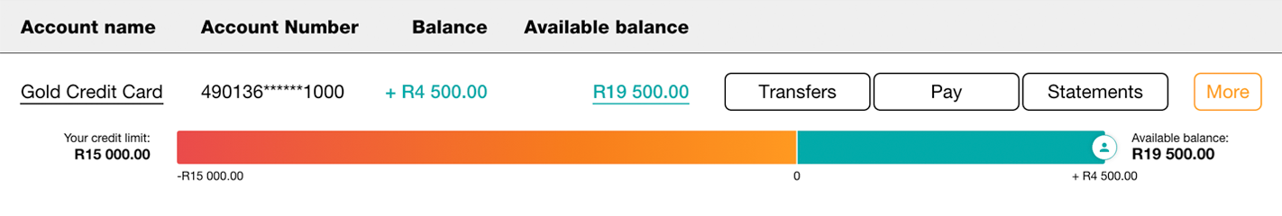
Few people realised that you can actually use a credit card just like a normal account. This means you never pay interest and get all the security and benefits of using a credit card. We proposed encouraging people to maintain a positive balance in their credit card. We showed this with a bright "FNB teal" positive balance bar.
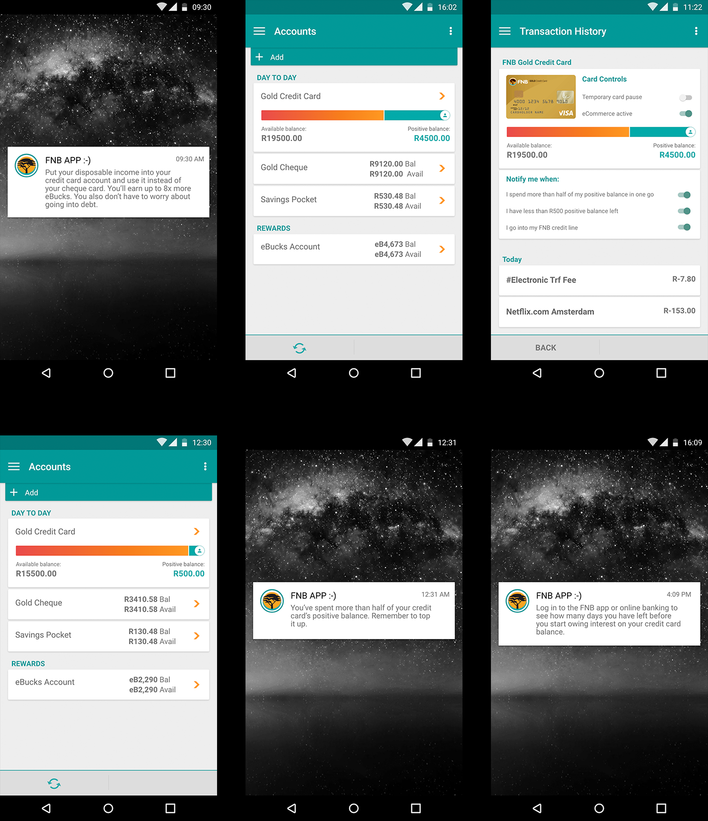
Our thinking was applied to the app as well. We made use of push notifications to help cardholders make better financial decisions and use the credit card in a way that benefitted them. We also made use of some of Visa's credit card APIs to give cardholders extra control over their cards. These APIs allow the bank to notify a cardholder when they reach spend thresholds and give them the ability to pause their credit card or stop it from being able to pay for eCommerce transactions.
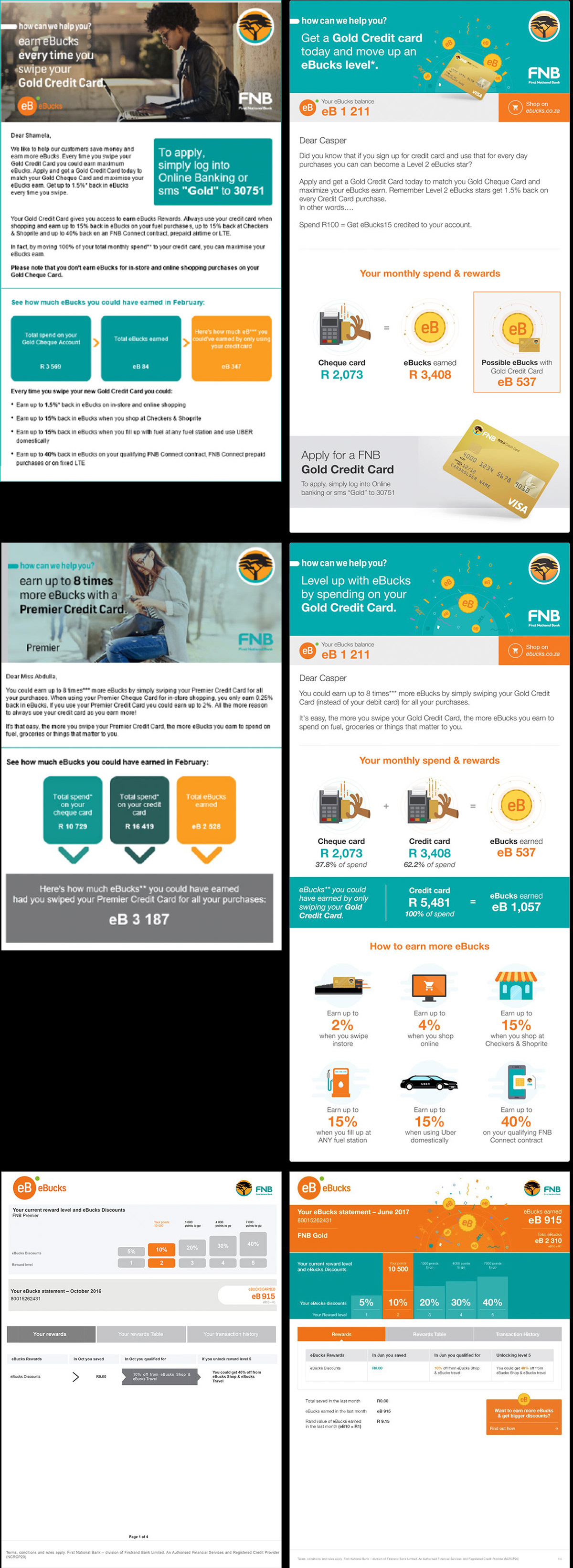
EMAILS
Since we were initially asked to have a look at the emails, we applied our thinking to them as well. Our goal was to make information as clear an easy as possible to understand. We wanted to take the guesswork out of using a credit card and show people that they could use their credit card as a financial tool rather than seeing it as a scary temptation that could get them into financial trouble.